
ALL IN TO VOTE
The audience is the newly eligible voter. 18-25 year old’s that may be voting for the first time. The goal is to create a looping social media graphic that motivates young people to vote.

Founded in 2016, the ALL IN Campus Democracy Challenge believes that higher education plays a role in graduating students into voters. For this brief I took a typographic approach based off the client’s website landing page. It features multiple instances of dynamic kinetic type animation with bright colors.
RESEARCH
Video from client’s website: https://allintovote.org/
With our main audience demographic being Gen Z students, tech is popular and Y2K aesthetics are trending. This approach will reflect a nostalgic yet modern digital & multimedia appearance by having a mixed media influenced college-like effect.
design alt 01:
high contrast mixed media
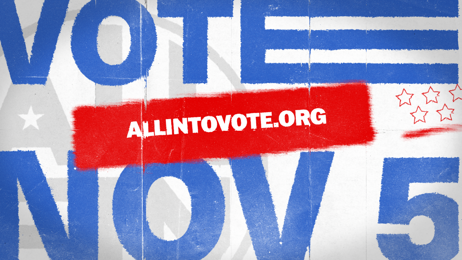
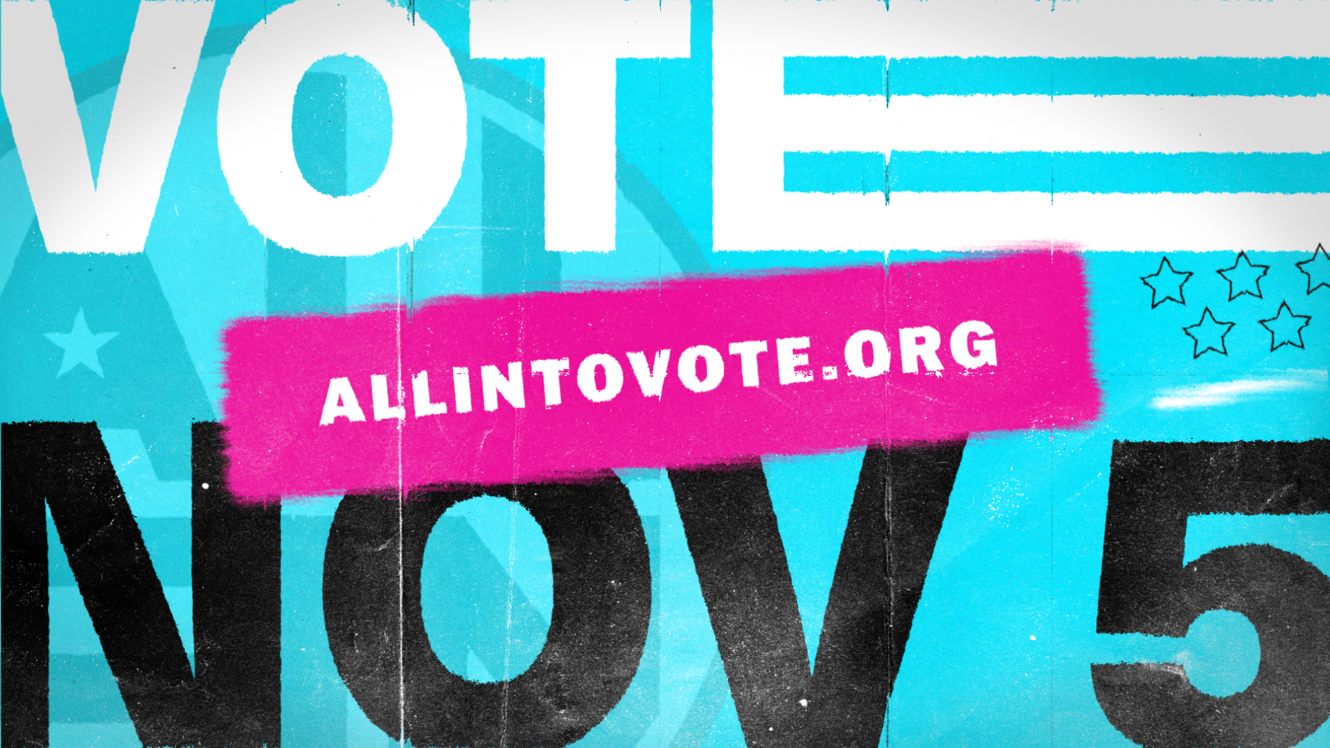
With a design heavily focusing on typography, large bold fonts will take up significant space to get the attention of someone endlessly scrolling through Instagram. Minimalist high contrasting colors will be used to maintain a bold and straightforward design.
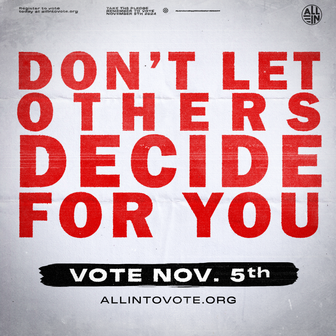
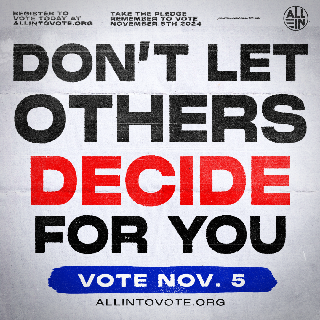
DESIGN alt 02:
LARGE, BOLD TYPOGRAPHY
design notes
The chosen direction was the 2nd design approach. The client’s notes were to tweak the kerning. As well as that the big block of red text lost hierarchy & legibility. It needed more variation.
For the animation I was advised to consider how to give an emotional impact without being playful.
FIRST PASS ANIMATION
ANIMATION process
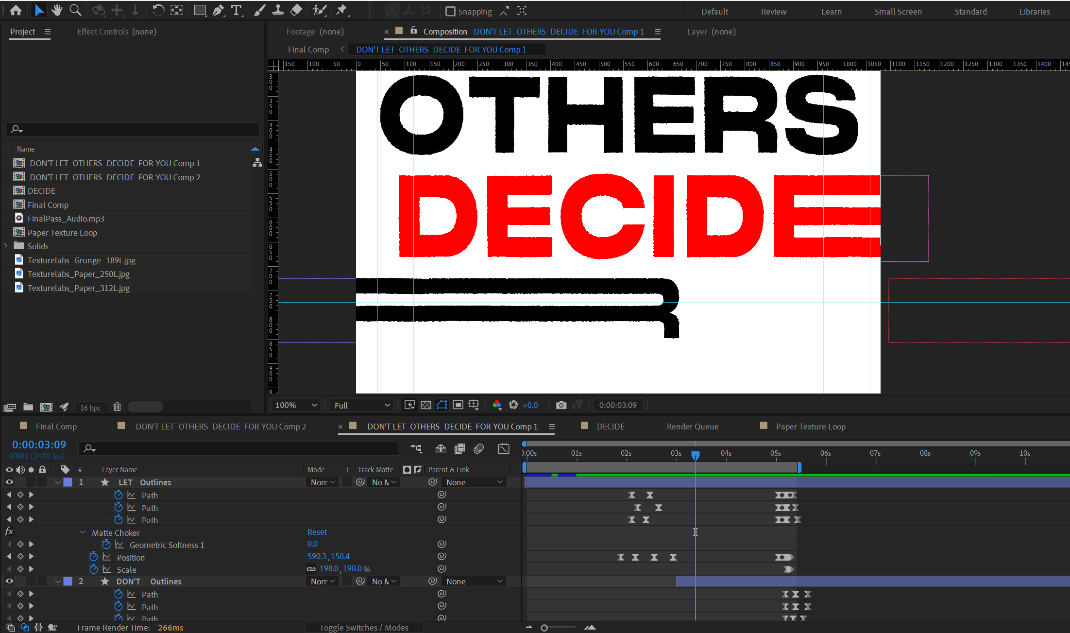
The paper overlay texture was done with a posturize time and wiggle expression. The stretchy text animation was done by creating shape layers out of the text and keyframe animating the points of the letters to stretch out and go back to their normal shape.
ANIMATION notes
With the previous notes applied the legibility of the text was doing much better. Except the animation was lacking tension and impact. All the text was moving in the same composition, and the introduction of “DON’T” was getting lost with the unnecessary stretching of “DECIDE”.
So to solve this, an highlight was added to be drawn over the “DONT” and gave the text different compositions. Since the stretchy text was unnecessary, the exit animation was changed to bleed out.
